Category x Quantity のPlot
titanic_plot.py
# https://github.com/PyDataTokyo/pydata-tokyo-tutorial-1/blob/master/pydatatokyo_tutorial_ml.ipynb
# のロジスティック回帰による生存者推定 plot をseabornを使って簡潔にやってみた
# 今回以外にもcategoryデータを利用するplotの例があってよかった
# https://stanford.edu/~mwaskom/software/seaborn/generated/seaborn.swarmplot.html
# https://stanford.edu/~mwaskom/software/seaborn/generated/seaborn.stripplot.html
%matplotlib inline
import pandas as pd
import seaborn as sns
titanic = sns.load_dataset("titanic")
_titanic = pd.DataFrame(
[
titanic.age.fillna(titanic.age.mean()),
titanic.pclass + titanic.sex.map({'female': 0, 'male': 1}).astype(int),
titanic.survived
]).T
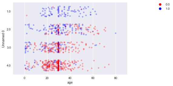
_titanic["Unnamed 0"] = _titanic["Unnamed 0"].astype("category")
#sns.swarmplot(
sns.stripplot(jitter=0.3,
data=_titanic, x="age", y="Unnamed 0", hue="survived",
alpha=0.3, palette=["red", "blue"])
plt.legend(bbox_to_anchor=(1.4, 1.03))
plt.tight_layout()